Wayfinding That Works: Digital Signage for Faster Customer Journeys
5 July 2026 · By Signex
Why wayfinding matters more than most teams think
In retail centers, corporate campuses, hospitals, and mixed-use buildings, poor wayfinding creates a hidden tax. People arrive late, miss entrances, ask staff for help, and often leave frustrated. In customer-facing environments, that frustration can reduce dwell time, lower satisfaction, and hurt repeat visits. In workplaces, it can mean delayed meetings and unnecessary interruptions at reception.
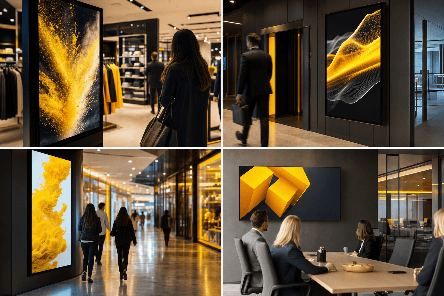
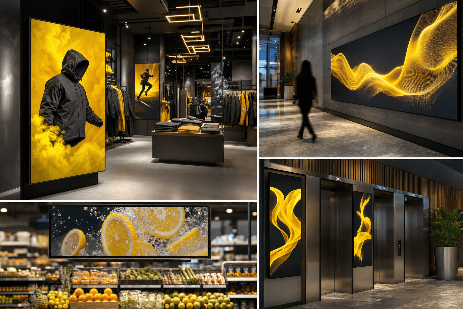
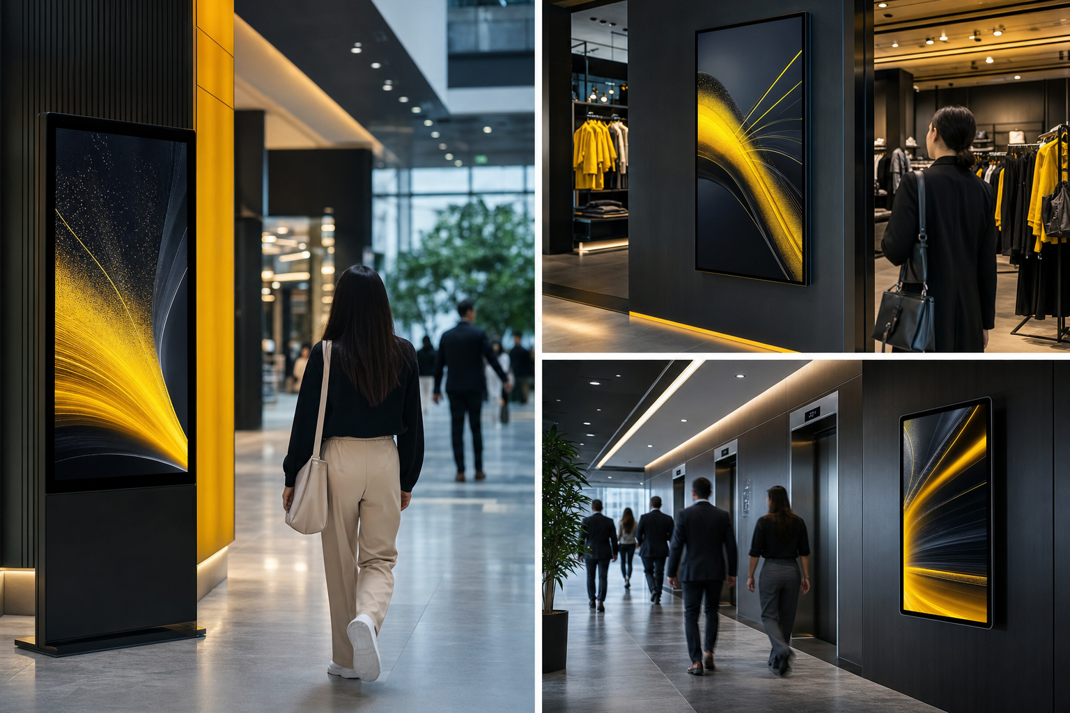
Digital signage is one of the most practical tools for solving this problem, especially where layouts change often or multiple audiences share the same space. Static signs can only do so much. Digital screens can adapt by time of day, visitor type, language, event, or traffic conditions, making navigation clearer when it matters most.
The real goal is not just directions, it is confidence
Good wayfinding is not about filling walls with arrows. It is about helping people feel sure they are in the right place and moving in the right direction. That confidence reduces stress and the need for staff intervention.
The most effective systems answer a few simple questions fast:
- Where am I?
- Where do I need to go?
- How do I get there?
- What should I do if I get stuck?
If a screen can answer those questions in under 10 seconds, it is doing useful work.
Where digital signage improves navigation most
Digital wayfinding is especially valuable in environments with one or more of these conditions:
- Frequent events, tenant changes, or temporary closures
- Multiple floors or buildings
- Several audiences, such as visitors, staff, and delivery teams
- Complex parking, reception, or security processes
- Language diversity, which is highly relevant in Mauritius
In these spaces, a screen at the entrance can guide people more effectively than a printed map hidden at the end of a corridor. Interactive kiosks can go further by giving step-by-step directions. Even a simple non-interactive display, if placed correctly, can cut confusion at decision points.
Design the journey, not just the screen
A common mistake is to focus on screen content before mapping the visitor journey. Start instead by identifying the points where people typically hesitate.
Look for:
- Main entrances and parking areas
- Reception and security desks
- Lift lobbies and stair access points
- Corridor junctions and floor transitions
- Areas near meeting rooms, clinics, stores, or service counters
At each point, ask what the visitor needs next. The answer may not be a map. It could be a short prompt, such as “Registration this way,” “Level 3, West Wing,” or “Customer service on your left.”
The best wayfinding systems use layered information. A person at the entrance may need a broad overview. A person on the wrong floor may need a focused correction. A person already near their destination may only need a confirmation cue.
Keep the content simple, local, and multilingual
Clarity beats cleverness every time. Use plain language, short labels, and high-contrast visuals. Avoid jargon, internal department names, or abbreviated room codes unless visitors already know them.
In Mauritius, multilingual communication can make a meaningful difference. Depending on the audience, a screen may need English, French, and Creole support. The key is not to overload every display with every language. Instead, use the space intelligently:
- Show the primary language first
- Offer a secondary language if space allows
- Use icons, floor colors, and landmarks to support comprehension
- Keep translations consistent across all screens
Consistency matters. If one screen says “Visitor Registration” and another says “Guest Check-in,” people may assume they are separate locations.
Use digital signage to remove friction at key moments
The highest-value use cases are not always the most advanced. Often, they are the moments when confusion is most likely.
Examples include:
- Arrival screens that confirm where to go next
- Live directory boards that update tenant or department locations
- Event signage that switches by session, room, or time slot
- Queue displays that combine waiting status with directional guidance
- Temporary notices for maintenance, rerouting, or access restrictions
A strong wayfinding setup can also integrate with QR codes or mobile links. A visitor scans a code at reception and gets a route on their phone. That helps when a person needs to continue navigating after leaving the screen.
AI can help, but only if the underlying system is well organized
AI can make wayfinding more responsive, but it is not a substitute for a clear information architecture. Its best use is in handling variation, not inventing structure.
Useful AI-driven features include:
- Natural language search, where visitors ask, “Where is HR?” or “How do I get to conference room B?”
- Dynamic content rules that adjust directions based on time, occupancy, or event schedules
- Multilingual support, especially for quick translations of standard instructions
- Analytics that reveal which destinations people search for most often
The risk is relying on AI to fix messy data. If room names are inconsistent, departments move often, or layouts are not mapped properly, the visitor experience will still feel confusing. The foundation must be accurate locations, updated directories, and a clear naming system.
Measure success with behavior, not just impressions
Wayfinding should be judged by whether it helps people move more efficiently. Useful metrics include:
- Fewer reception interruptions for directions
- Reduced average time from arrival to destination
- Lower late arrival rates for meetings or appointments
- Fewer visitor complaints about locating spaces
- Higher completion rates for self-guided journeys
If possible, compare the experience before and after deployment. In larger sites, observe how long visitors pause at decision points. In staffed locations, ask front-of-house teams whether the volume of directional questions has changed.
A practical rollout plan for Mauritius-based sites
For businesses in Mauritius, a good rollout can be done in stages.
- Map the main visitor paths, from arrival to destination.
- Identify the top five confusion points.
- Standardize room names, floor labels, and department titles.
- Create simple directional content in the languages your audience needs.
- Place screens at decision points, not only at reception.
- Test the flow with real users, including first-time visitors.
- Review and update the system whenever layouts, tenants, or processes change.
This approach keeps the project manageable and avoids overbuilding. You do not need every screen to be interactive on day one. You need the right information in the right place.
Conclusion, make navigation feel effortless
Effective wayfinding is one of the clearest examples of digital signage doing practical work. It saves staff time, improves the visitor experience, and supports smoother operations. In complex retail and corporate spaces, it can also reduce lost opportunities caused by confusion and delay.
The winning formula is straightforward. Map the journey, simplify the message, localize the language, and place screens where decisions happen. Add AI only where it improves clarity or responsiveness, not as decoration. If people can find their way quickly and confidently, the signage has already delivered real value.
Signage stopped being a poster; it is now software with a screen. Explore the wider Graphic Supplies health ecosystem.